

Albert Watson: A Life in Pictures
Words: Mark Edward Harris

Leslie Weiner, Paris, 1989
But as the Scotland-born, New York-based photographer’s latest book KAOS (Taschen) illustrates, rather than remain within the confines of the celebrity world (despite having shot over 100 covers for Vogue and 40 covers for Rolling Stone), he photographs whatever is of interest to him, from Tutankhamun artifacts to sensual nudes to Scottish landscapes. Whatever Watson’s subject matter, the resulting images are meticulously crafted. His powerful concepts are further realized in his New York studio, where, as a master printer, he continues to work with silver-gelatin papers as well as modern processes.
Many of your portraits, celebrity and otherwise, have Surrealist elements. Some, such as “Bowie Box” and “Fanny with Tree Calipers” evoke a sense of entrapment. That’s relatively dark and deep for images that have a commercial imperative.
There are so many people that have explored this theme or literally used boxes. Joseph Cornell’s boxes, Surrealist posters with people’s heads in boxes. I’ve been very inspired and influenced by Surrealists in general—Andre Breton, Dali and also the whole Dadaist movement. Some of that’s based in Surrealism; it could be Marcel Duchamp. They are all inspiring. You can dip your toe in it and enjoy it. With Bowie I told him I had several ideas, and this was one of them. I was a graphic designer and spent seven years at art college. I enjoy doing conceptual work.

Aicha Haddaoui, on the Road to Marrakech, 1997
How was the Bowie photo created? It looks as if he’s disembodied.
And that’s not retouched. We made a special table and had him slotted into the box. Nowadays people think, “Oh, you did a portrait of Bowie and then in Photoshop put his head in the box.” That’s not the case.
I have had the privilege of seeing you at work in the studio and notice that you often use black foamcore and flags to deflect light and create stronger shadows and contrast. That approach is evident in the Bowie image.
I do that all the time. The ideal studio is a black box. A lot of the studios you go into are white. It’s nice aesthetically, but it’s not the best. The light bounces around, hitting walls, an air-conditioning vent, and so on. If they were painted black then it would be a non-issue. I prefer that the light I’m dealing with is the light I created, not any from an arbitrary wall that someone painted white that’s six feet away. I once had a black studio because it was so narrow, but it was depressing. The studio I’m using now in New York is white and we use a good amount of setup time getting it black. I want total control of the light. The majority of photographers today use softboxes, because basically everybody looks quite nice lit by one. But then you don’t get as powerful a result.

Egypt, 1987
What’s your go-to lighting setup?
What am I usually doing? That’s a really good question. I’m not usually doing anything. I’m moving the lights around all the time. Sometimes going direct, sometimes I’m mixing strobes with tungsten light. Sometimes I’m bouncing light. I’m changing the light the whole time, so that’s why a lot of the work I do looks so different. People sometimes ask, “Why don’t you use the same light setup so it will give you an identity?” I personally don’t like that.
_“Fanny with Tree Calipers” is similar in approach to the Bowie shot. _
She’s in a tree-measuring device from the Victorian Era. I come across items that I find interesting that eventually find their way into my work. I’ve done other photos of just the objects themselves, such as sexual fetishes from Morocco that are textural. I like them because they’re connected with magic. You sleep with two bones wrapped in paper under your pillow and there’s a strong chance that you’ll get pregnant with a boy. The celebrity objects that I’ve photographed—Neil Armstrong’s space suit, Tutankhamun’s glove, Elvis’ gold lame suit and his comb that was in his bedside table—all of these things are conceptual. I like the conceptual association like Elvis’ gold lame suit rather than, “Oh, my God, that’s the most beautiful still life.” The same with Tutankhamun’s glove. The main thing is that it’s “his” glove. That’s conceptually driven rather than texturally driven, such as Irving Penn’s photograph of an anonymous gardener’s glove. This isn’t to take away from Penn’s photograph. He’s one of my heroes. But this is to explain how one is textural and the other is conceptual. Tutankhamun’s glove is conceptual.
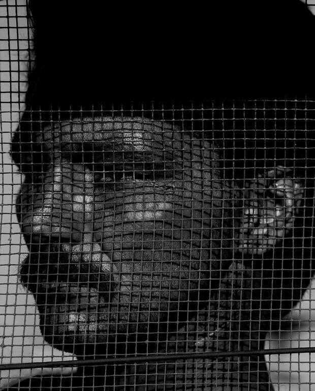
James West, Louisiana State Penitentiary, 1991
You have a strong identity, but it’s from presenting polished, superbly crafted work. Photographers like Bill Brandt and Jeanloup Sieff did not cubbyhole themselves into a specific photographic genre either.
But Sieff did in a sense by using a wide-angle lens all the time. Bill Brandt’s approach was much wider than Sieff’s. He was shooting so many diverse things. That’s what makes it so difficult for us. Brandt was a Surrealist photographer as well. People had a hard time with my work in the beginning because they could never pinpoint me. I said, “In the end it all looks like me because it is me.” I was four years a graphic designer, three years at film school. If you look at the work, it’s divided into graphics or film or a combination of the two. The common thread is that they are conceptually graphic. This includes TV commercials. I’ve directed more than 500 of them. My background in graphic design taught me how to think conceptually.
Where do your ideas come from?
That information comes into my head abstractly. If you look at one of my conceptual shots such as the monkey with a gun—sometimes thoughts come into my head and I’m not quite sure where they came from. I don’t have a formula. I have roughly 18,000 art books. Maybe something was triggered going through all that artwork. I’m looking at the Sistine Chapel on Tuesday and suddenly photographing a monkey with a gun on Wednesday. How do the two relate? It’s related to creativity and inspiration. I find that a lot of young people do not have a good knowledge of art. “What do you think about the art that came out of the Weimar Republic?” “What do you think about Klimt, Russian Constructivism?” “What about Rodchenko?” “August Sander, a portraitist?” “Kertesz, a Hungarian reportage art photographer?” They have no idea.

Alina with Billiard Ball, New York City, 2010
That sort of knowledge gives depth, especially as you alluded to in conceptual work.
A lot of my work is set in cement and over-the-top powerful. It’s a bit stainless steel as opposed to a softer, fuzzier look. A Vogue editor once said to me, “Does every shot have to be such a f***ing epic?” I had a good reply to that. “Yes. Today is Tuesday, the 19th of February, and I will never get this day back.” Creatively, you’ll never get that day back.
Did the editor mean it as a complement?
I’m on the side of a mountain with a portable strobe, two of those from different angles in the wind, trying to control a dress, trying to do the shot at f/32 so I can capture a mountain range behind her and it looks like Wuthering Heights or something. Then at that point the person says out of frustration, “Does every shot have to be such a f***ing epic?” I’m not totally unsympathetic to that. I once had a very good creative director say to me, “Sometimes your imagery, your shots, are simply just too strong.” The word strong is normally applied in a good way. Strong architecture. Strong painting and so on. I’m trying to make my work good. To make it memorable.

Fanny with Mirrors, New York City, 2010
What makes a good picture? A lot of the times it’s memorability. If I say to you, “Van Gogh’s sunflowers,” bingo, you’ve got an image in your head. If I say, “Gauguin, Tahiti,” you’ve got that in your head. If I say Picasso, you might choose something from his Rose Period, his Blue Period, the Surrealist period, the almost-abstract period, the disjointed period, etcetera, but you’ll have an image in your mind.
_Your approach in a sense is using every frame as a canvas. _
You try. Sometimes you’re up against the odds. You’re in a room with ten ninja fighters and eventually one of them gets a knife to your throat. So you do your best. I want people to be happy, but sometimes you have to protect them against themselves. A creative director can have their job on the line, they picked you. If the returns are shitty, they can be in danger of losing their job, so you have to be sympathetic. But if you end up with a boring shot, why are they hiring you?
How are you printing your images?
We do everything in-house. Sometimes I do some silver printing. We had a show two years ago called “Silver Linings” that I loved. They were all 20×24 silver contact prints on Ilford paper. I remade all the 20×24-inch negatives to size from digital files, output on an HP printer and made contact prints. The original images were either scanned film or digital captures. I shoot almost everything digitally these days. Phase One is my go-to camera. For pigment prints I usually use a Hahnemuhle heavyweight matte paper. I’ve always loved to print. I was in the darkroom right from the beginning.
You have used almost every camera format over the years, including a number of them on a single project.
The only 35mm I had in my recent show at the Taschen Gallery in Los Angeles was from the Louisiana State Penitentiary series in the early 1990s. It’s fascinating to me, when I look at my work over the years, how the camera changed what I was doing. There was something in the 35mm that I actually loved. In the prison I did 8×10, 4×5 and 35mm. I didn’t use my Hasselblad there. I used a lightweight tripod with a Nikon and I did a lot with the 55 macro lens. With the tripod I was intent on maximizing sharpness. I don’t like pictures that are a bit mushy. I don’t mind pictures that are mushy if I as a photographer want to do out-of-focus, blurred, moving shots. But it should be under my control.
You’ve said in the past that photographing Alfred Hitchcock was a breakthrough moment in your career. How did you go from having no celebrities in your portfolio to getting an assignment to photograph such a major one?
The art directors of Harper’s Bazaar at that time had heard of me through the photographer Hiro. He had met me and recommended me to them. He was in New York, and the magazine wanted someone in LA to photograph [Hitchcock] locally. At that time I was an LA photographer. I had a studio on Melrose that was originally built by photographer Hal Adams. I was shooting everything from hospital appliances to fashion and department store catalogs to insurance ads to car photography. I shot a lot of cars. But we did this shot in Hitchcock’s office at Universal studios with an umbrella lighting him and two lights on the white background.
Describe the concept behind the shot.
It was for the Christmas issue of Harper’s Bazaar, and Hitchcock, who loved cooking, was giving the magazine his recipe for goose. Initially, they wanted him to be photographed with a cooked goose on a serving plate, and I said I thought it would be funnier if he were holding a plucked goose with some Christmas decorations around its neck. They agreed. He was fantastic to work with. He helped me out. I was nervous and he wasn’t.
Addendum
All images copyright Albert Watson. See more of his work at albertwatson.net. For information on exhibitions, print sales, photo usage, books and publicity, contact aaron@cyclopsnyc.com.
All images copyright Albert Watson. See more of his work at albertwatson.net. For information on exhibitions, print sales, photo usage, books and publicity, contact aaron@cyclopsnyc.com.